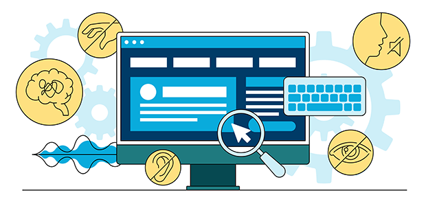
1 in 5 people in the UK may be impacted by web accessibility barriers
Chris Todhunter, Technical Director at Studio Republic explains the importance of online accessibility: “Web accessibility should be seen in the same way as a high street shop without wheelchair access, or a cinema without a hearing loop - excluding a website user because of their disability has long been classed as discrimination in the USA and we're quite a way behind in the UK in terms of legislation. In fact, 97.4% of 1 million website home pages tested in a WebAIM 2023 study were found to have accessibility errors. The most common failures are actually pretty easy to fix.”
There are also the effects of the loss of revenue to businesses by missing out on fixing errors: “Beyond the obvious issues around discrimination, there is a huge commercial benefit to ensuring that websites cater for the widest possible audience. The collective online spending power of disabled people in the UK is estimated to be worth £24.8 billion per year. With 7 in 10 disabled people clicking away from websites they find difficult to use, this amounts to a huge loss of revenue for inaccessible online retailers (an estimated £17.1 billion in 2019!).”
7 common web accessibility mistakes - and how to correct them
To help combat accessibility issues, TestLodge has identified the most common accessibility mistakes and provided simple ways to correct them so websites and software are easy to use by all.
Not making your keyboard navigation accessible
It is important to recognise that not everyone will be using a mouse to navigate a website. Those with a motor impairment, such as difficulty using their hands or utilising fine motor skills it takes to move a mouse, may use the keyboard instead. Also, keyboard navigation is used by visually impaired users who rely on assistive technology such as screen readers, as they cannot see where to move the mouse.
To improve your site’s keyboard navigation, properly structure webpage HTML to be in the order in which keyboard-only users will navigate the content and make focus indicators clear on links or interactive elements.
Forgetting to add alt text to images
One of the most common web accessibility mistakes is failing to provide alt text on images. Chris explains: “This is an easy fix and gives much deeper meaning to your web pages for blind or partially sighted users.” The alt text is read aloud to visually impaired users via their screen reader, and is also indexed by search engines which can aid SEO. Another bonus is that the alt text will display on the page even if the image or element fails to load. According to Microsoft, you can add alt text to elements such as pictures, clip art, charts, tables, embedded objects and audio or video multimedia.
Using tables for layout, rather than data
Chris also points out that using tables for layout can also cause an issue: “Tables work row by row. While visually a layout may look correct, for a screen reader the context of the information will be meaningless.” To address this, CSS provides much more flexible and accessible methods for laying out page content.”
Incorrectly labelled or unclear form fields
Adapting form fields for accessibility is key for data capture or simply to provide a way for users to contact the business directly. To do this with accessibility in mind, always label and highlight the focus input elements on your required form fields and add clear instructions. For example, add ‘Phone number’ as a field label instead of a vague text, such as ‘Contact information’. You should also ensure that the form can be completed using keyboard navigation, and provide relevant error messages.
Opting for low contrast text and background
It is important to keep in mind the contrast as certain contrasts and colours can make it difficult for users to identify edges and shapes, or even read the text itself. As Chris comments: “This excludes not only partially sighted users, but potentially those with any variation of colour blindness.” For example, red text against a grey background or interactive element is not easy to read. You can use a contrast testing tool which can highlight appropriate and inappropriate contrast ratios across your site.
Not adding subtitles and captions to videos
Another common mistake people make with their on-site multimedia elements is not adding subtitles or captions to videos. Not everyone wishing to view your videos will be able to hear the audio or turn it on, and subtitles can also help with comprehension of the content. By adding captions and subtitles to your on-site videos, you will improve accessibility and boost user engagement.
Adding non-descriptive links
A non-descriptive link, such as using anchor text ‘Click here’, does not convey the purpose of the link, which is not helpful to screen reader technology. To provide users with the context of where a link is taking them, a descriptive link will improve their usability and comprehension of the site.
An example of how to edit link text, ‘Learn more about accessibility here’ is more descriptive than an ambiguous ‘Learn more’ label. Finally, Chris points out the benefit of adding in descriptions to business owners looking to improve their web visibility: “Giving context to links also has a big SEO benefit, as it gives search engines context about each link on the page.”
Scott Sherwood, founder of TestLodge says: “As a website owner, it is crucial that people with accessibility needs are considered when designing a website or browser app as excellent user experience should be key to your strategy. Acknowledging that not everyone uses a mouse to navigate around a web page or some visitors to your site may utilise screen readers and implementing accessibility practices will keep your online presence more inclusive.
"Building and testing your site with optimum accessibility in mind, you’ll be creating a great user experience for everyone, no matter how they interact with your site.”


