
Accessibility through the eyes of impaired users
About 15% of the world’s population, i.e. digital product users, have some sort of impairment. In 2020, WebAIM conducted a study which found that most websites do not offer a fully accessible experience. They found that less than two percent of the world’s top million websites are offering accessible content to those with disabilities.
Product accessibility is a product development practice that enables all people regardless of their disabilities (visual, cognitive, auditory, motor) to effectively use said product. Your average product presumes the user base to have good vision, cognitive and auditory abilities. This isn’t the case for 15% of the world population. With most digital products, motor disabilities are less of an issue.
When did you realise the extent of this problem?
Being a designer, I can’t help but notice accessibility blunders. Trust me, I notice them a lot more often than I’d like to. The realisation hit when my team and I were researching accessibility for our own work and blog. It turned out that our personal experience is backed up by the statistics. So much so, that a staggering majority of products aren’t accessible to a full extent.
How does your accessibility prototype aim to solve this problem?
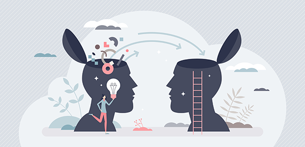
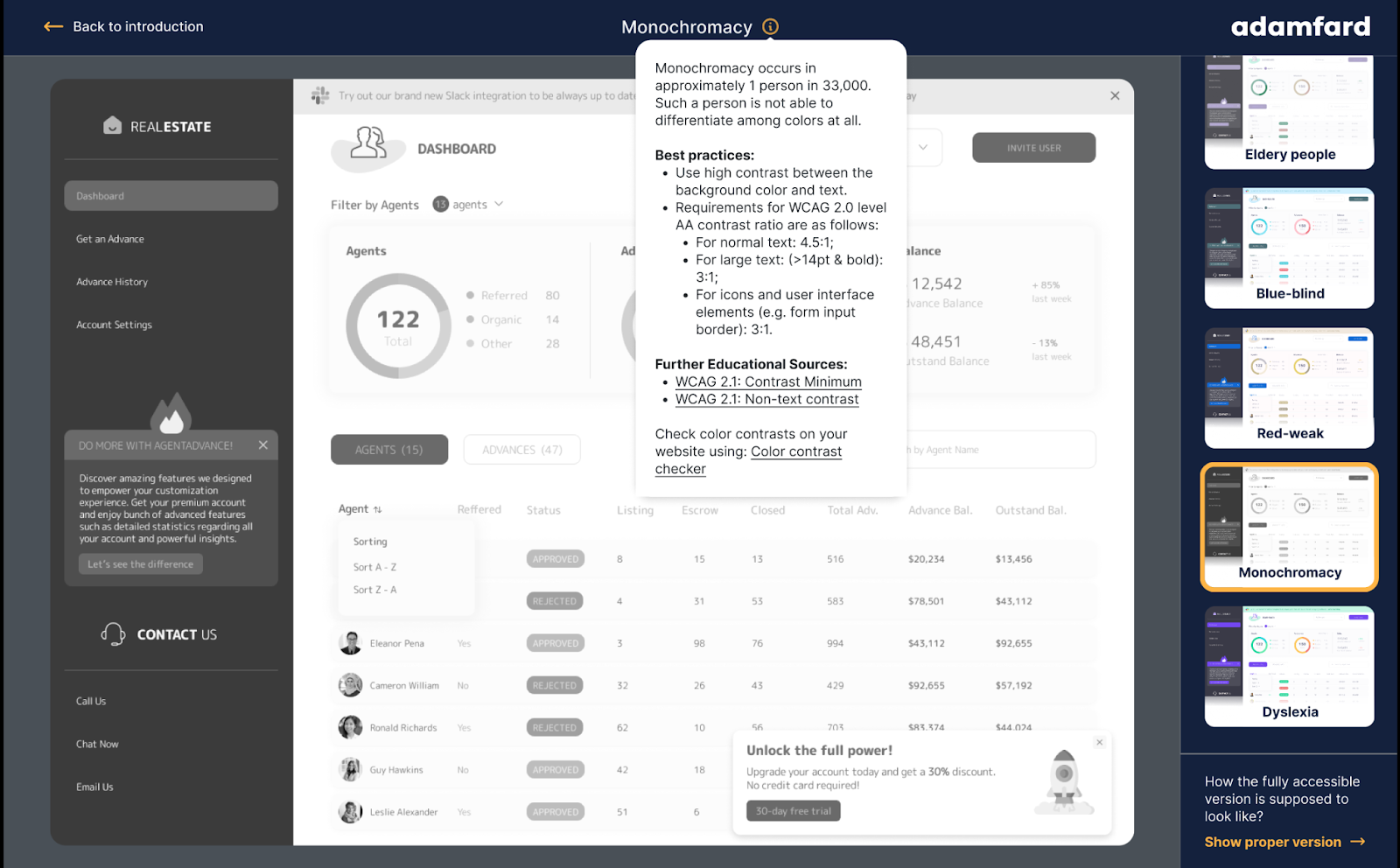
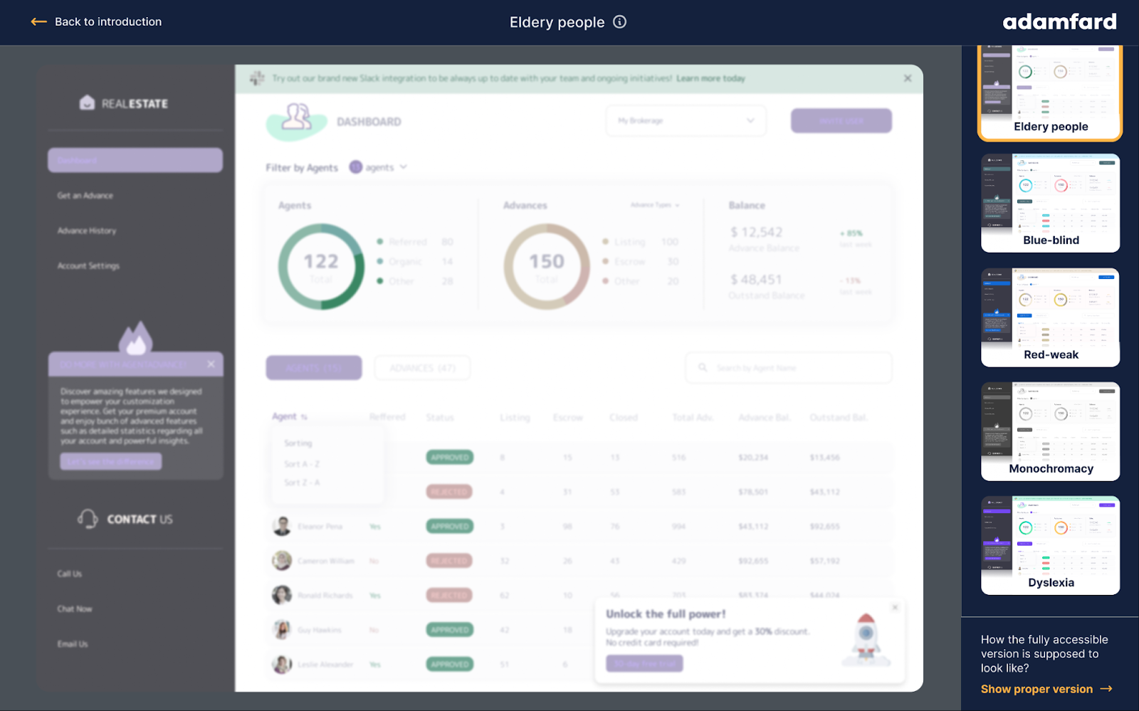
What our prototype attempts is to help increase empathy for an impaired user. We quite literally simulated how an impaired individual would experience an inaccessible design. Spoiler alert: this experience is miserable. That said, we hope that those who took the time to click through the prototype, will be more mindful and empathetic toward people with disabilities.
On top of that, we also referenced a lot of good practices and sources on accessibility, so that, after having read through the prototype, the reader will be equipped with actionable knowledge on how to create an accessible experience.
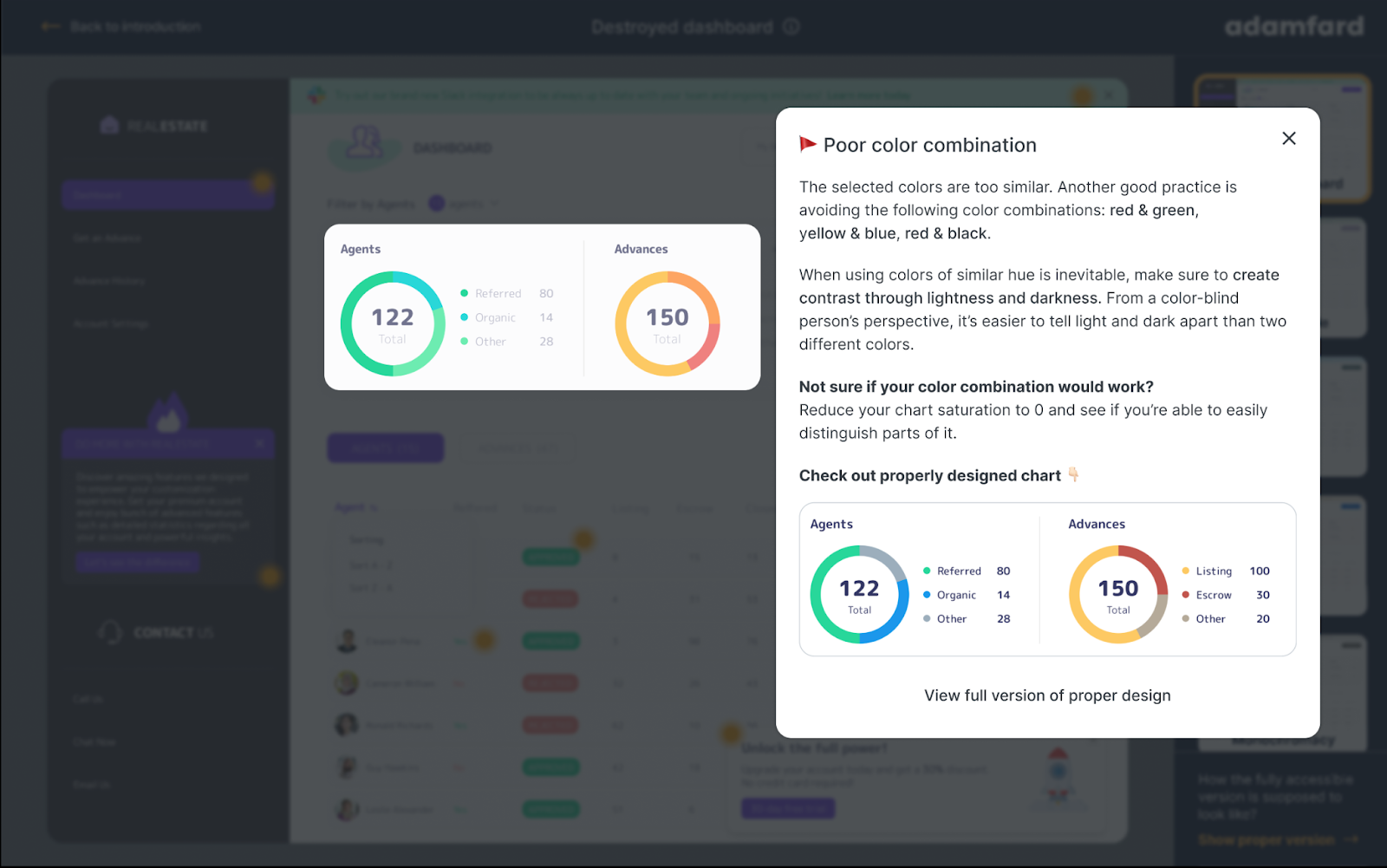
Lastly, to help cement the knowledge on accessibility, we’ve compared the accessible and inaccessible design side by side, so that you could spot issues faster.
Could you explain the technology behind the prototype?
The prototype is created in Figma, which is a tool for designers of all kinds: mostly product designers. In a nutshell, a prototype is a series of clickable images that are connected together, which is a quick way to create an interactive experience to get our point across. We use this same method to validate our concepts with users before finalising designs.
How might impaired users see digital products?
When we’re addressing elderly users, the most common challenge that they have is low-vision. To tackle this issue design-wise, you make sure that things like text size and contrast are compliant with accessibility guidelines.
With any form of colour-blindness, you would focus on avoiding certain colour combinations (such as red & green, yellow & blue, red & black). Additionally, colour should not be the only means of communication (for example success messages should not rely on green colour only without any other visual reinforcement such as icons).

Pertaining to dyslexia, from the designers’ perspective, you would mostly focus on the content. In order to be accessible, the content needs to be short and simple and avoid compound sentences, passive voice, and metaphors. Additionally, being able to navigate the interface with a keyboard is another adaptation that can help a number of visually impaired users.
How can designers alter things such as text size, colour contrasting and font styles to adjust the needs of impaired users?
Depending on the type of impairment there are different areas you would need to focus on. For users with visual impairments, you would need to ensure a readable text size (usually 14-16px. and above), ensure a good contrast among elements, make your design screen-reader-friendly, etc.
There’s a variety of best practices that can’t all be addressed in a single answer. A good place to get started with these practices is to click through the prototype. Then, if you’d like to dig deeper, WCAG (web-content accessibility guidelines) is the place to go.
How can errors such as content overlap and hidden buttons and search bars can majorly disrupt user experience?
Unintentionally layering interactive things on top of one another simply means you’re hiding content away from the users. A user interface is two-dimensional. Introducing depth where there shouldn’t be is basically impeding users.