
5 Tips to Improve User Experience of Your Ecommerce Website
Ecommerce has become fiercely competitive, especially after COVID-19 since most businesses have started selling online. To stand out in this overcrowded space, attracting and retaining customers is a tough job.
There are numerous options available to customers and eCommerce businesses must invest significant efforts to woo them. And simply offering high-quality products isn't just sufficient anymore. Fortunately, even smaller brands can compete with established ones online without hefty marketing budgets.
One effective strategy is enhancing the user experience (UX) on their websites. The simplest way to make the online experience memorable is to help customers find information or complete a transaction as quickly as possible.
In this article, we bring you 5 effective ways you can improve your eCommerce website UX, increase user engagement, and ultimately your profits. Let’s get started.
Why is UX Important for an Ecommerce Website?
1. Improves Usability
A well-crafted user experience (UX) is essential for determining the usability of an eCommerce website. Poor usability can lead to customer frustration, ultimately resulting in site abandonment.
Amazon, often considered the pioneer of eCommerce, is renowned for its user-friendly design. With features like a prominent search bar and a streamlined checkout process, Amazon makes it effortless for customers to find and purchase products.
2. Increases Visitor Engagement
The goal of eCommerce UX is to reduce user friction, aiming to enhance engagement and ultimately drive sales. And if you’re website is confusing or difficult to navigate, the visitors will leave it midway, without making a purchase and are likely to never return.
However, offering a superb user experience can cultivate customer loyalty, improve conversion rates, and incentivise customers to spend more on your products.
3. Facilitates Conversions
Your eCommerce UX design is the deciding factor whether your eCommerce business will be a success or failure. Every single aspect such as quick feedback, intuitive navigation, engaging CTAs, the media, and the checkout process can affect your eCommerce game.
Improving the user experience of your customers will make them spread your business via word of mouth which in turn will bring you more conversions.
4. Strengthens Brand Image
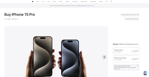
An engaging eCommerce UX that aligns with your brand’s identity and values can help you win the trust of your customers. For example, the sleek and minimalist design of Apple's website brings to light its commitment to simplicity and innovation.
5 Tips to Improve Ecommerce Website User Experience
Now that you are familiar with the importance of a great eCommerce UX, let’s have a look at five effective ways to achieve it.
1. Simplify Information Architecture based on Product Categories
Presenting information in a simple and easy-to-understand manner can improve eCommerce website UX. Incorporate a clear and organised product categorisation system so that customers can easily find the product they are looking for without any hassle.
For instance, IKEA has a simple and intuitive layout and has grouped diverse products into categories to make browsing easy for users.

2. Design an Intuitive Navigation
A cluttered website with confusing navigation can quickly disorient visitors. Your design should smoothly guide customers through your online store.
Ensure it's simple for shoppers to discover all your brand's offerings. Take cues from retailers like Walmart, who provide a well-organised main menu allowing customers to easily find the products they're looking for.
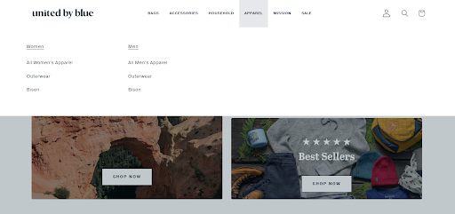
For instance, the United by Blue website has a clean and user-friendly navigation menu including bags, accessories, household, apparel, and so on ensuring that visitors can easily find what they are looking for.
3. Decrease the Steps to Checkout
Few things can damage your eCommerce sales as much as a poor checkout experience. It's the last interaction you have with your customer, and it should instill feelings of security, confidence, and readiness to make a purchase.
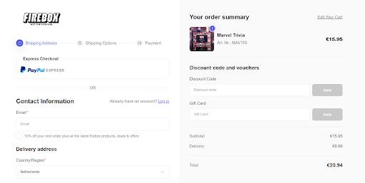
Ensure transparency in the checkout process, including information on taxes and shipping costs to avoid any unpleasant surprises for your customers. Simplifying the checkout by reducing unnecessary form fields can also improve the experience, minimising the amount of information your audience needs to provide to make the payment.
Firebox is an excellent example of this as it has minimal checkout steps which in turn makes shopping hassle-free for customers.
4. Engage your Customers with Content and High-Quality Media
Investing in high-quality product images helps to differentiate your online store from competitors. When faced with a choice between a website featuring average images and one displaying high-quality images, shoppers are inclined to choose the latter.
Having professionally shot product images and videos is likely to impress the visitors, make them stay longer on the website and ultimately persuade them to make a purchase.
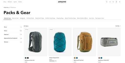
For instance, Patagonia has used high-quality images along with captivating stories to keep visitors glued to its website. The close-up shots bring to light the intricate details.
5. Make CTAs Prominent and Engaging
There is no point in a CTA if it fails to persuade the visitors to take action. Having clear and compelling calls to action is a must to guide users towards making a purchase or signing up.
Utilising a single Call to Action (CTA) maintains message clarity, enhances readability, and simplifies analytics collection. However, in your blog design, consider incorporating a secondary CTA button. Beyond directing readers to purchase your product, you could prompt them to download an ebook, read a relevant blog post, or subscribe to your email newsletter.
A crucial aspect of optimising CTAs involves A/B testing new options on your site and analysing which ones yield the best results.
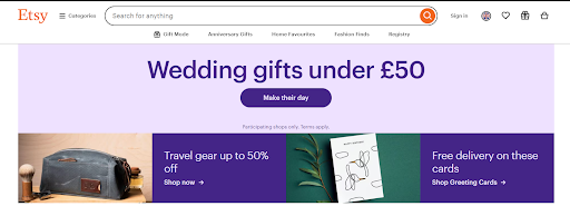
For example, Etsy has some great call to action that makes its user experience stand out from the rest such as “Make their day”.
Final Thoughts
These were some of the easy-to-implement yet effective ways of increasing your eCommerce website UX.
Now, it's time for you to put them into action. Over time, these straightforward solutions will yield significant financial advantages for your online business.
Also, don't forget to explore our other articles to learn more actionable tips and strategies on how to take your business to the next level.

