
5 Common Website Mistakes You Need To Fix

Falling victim to common website mistakes isn’t the worst thing in the world, but it is something you should look to rectify as soon as possible. In this article, we’ll analyse five of the most common website mistakes and what you can do to fix them.
Your message is muddled
In today’s modern world, where an online brand means everything, your message is almost as important as the quality of your products.
Whether it’s your company story or your stance on a major social issue, getting your message right and read is vital. If this isn’t coming through loud and clear on your website, you have a problem!
A muddled message can come in many forms. Perhaps a tonally poor design is covering up the seriousness of it or your calls to action aren’t direct and assertive enough. From content to logo design, the message of your brand can quickly become misinterpreted or ignored.
Thankfully, there are tons of examples to learn from across the business world. Take a brand such as Monday.com. Their website is hardly groundbreaking, but it leaves you with no doubt as to what their product does and how it can improve your workflow personally. The use of moving graphics displaying the functionality of their tool immediately puts the user in the driver seat and tells them everything they need to know.
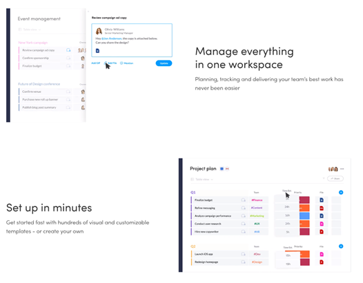
Image Monday.com
Another excellent example is veteran consultancy Vet Comp & Pen. A much more serious message devised for a specialist audience, but equally as impressive in execution. Rather than the fun, “we’ll sort that out for you” tone that Monday.com takes, this website prioritises sensitivity and assurance, solidifying a message of solidarity and professionalism through short copy that the user will have been hoping for.
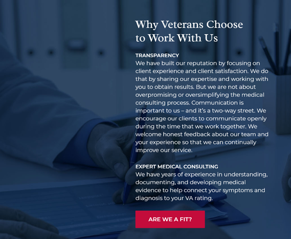
Image Vet Comp & Pen
A lack of content diversity
Content is one of the most important elements of a modern website. It helps audiences find your site and convinces them to stick around.
Whether you’re trying to sell products or win clients, content is one of the best ways to do it. And yet, most people are lazy with their website content.
Sure, blogs are good, but they are not the be-all and end-all of content production. To really stand out and develop a website that both ranks impressively and convinces users to come back, you need to diversify your content output.
Try giving video a try. You don’t need to match the best on YouTube, but some quick behind-the-scenes content or product highlights can help add some much-needed context to your business and give people who don’t have time to read an 800-word piece the chance to learn more about your business.
Likewise, audio is a great way to branch out and expand your business. Podcasts are booming right now, giving businesses a chance to reach consumers passively.
Missing the ‘boring’ stuff
When we first design a website, it’s easy to get caught up in the more ‘exciting’ elements.
What colour scheme should I go with? How do I incorporate my branding? What if we experimented with VR?
All very exciting, but this distraction might lead you to miss out on some of the most important elements of web design, even if they are a little boring.
A great About Us and Contact Us page are crucial to winning over more cautious visitors and providing a more complete browsing experience. Not only do they provide a level of reassurance, but they are used much more frequently than you think. Without this vital information, people will struggle to get in touch about customer queries, contact you about media opportunities and test the legitimacy of your website.
While dull in concept, these pages are a chance to do something truly unique with your business. Take Anton & Irene, a company that displays their knowledge of both branding and design with an abrasive and enticing About Us page that both reassures you of their ingenuity when it comes to their business and makes you want to learn more. Far from boring.

Image Anton and Irene
Always think about your website from the point of view of your typical user. That might mean forgoing some of the more innovative elements of your design, but it’s worth it for keeping them happy and reducing your bounce rate.

SE Oh-No’
If you understand SEO, it can be one of the most exciting parts of running an online business. If you don’t, it can feel overwhelming and frustrating.
SEO is nothing to get upset about though. You might not pick up the intricacies overnight, but even a basic application of its principles to your website can make a big difference. Without SEO, people will struggle to find your business, and that’s much more likely to keep you awake at night than keyword research.
Some of the most basic elements of on-site SEO all webmasters should focus on include:
- Making your website fast
- Optimising for the right keywords
- Improving your metadata
- Optimising content
- Making your site ‘crawlable’
Once you’ve fixed these issues, you can start worrying about more advanced SEO, such as your backlink profile.
You forgot about mobile
Amazingly, there are still some people out there not optimising their website for mobile.
It sounds hard to believe, but the rise of portable devices and the general population’s preference for them hasn’t convinced some people to think beyond the desktop when it comes to web design.
Sure, desktop designs can be a little more innovative, but a website should look to solve user queries and provide an accessible experience first and foremost. With people spending on average 5 hours a day on their phones, the main way to do that in 2021 is by adapting for mobile.
When it comes to mobile, optimisation and speed are everything. If your pages load slowly and look like something out of 1999 (only smaller) users won’t stick around to see what you have to offer. Optimising means bold clickable buttons, improved text readability and connection with social platforms for quick sharing.
For some more insight, check out these designs from SEO Pressor and get to work building an entirely unique experience on mobile that still reflects your brand.
It can become frustrating and a little boring to always hear how your website needs updating or could benefit from a digital facelift. However, these are important updates to stay on top of. Most issues aren’t cosmetic, but functional changes that influence how your site performs on Google and appears to the average visitor. Don’t be afraid to commit plenty of time to developing it years after launch.