THIS is what happens when the UK’s leading brand logos change colour
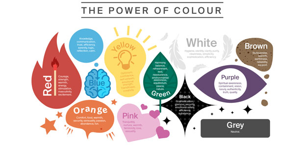
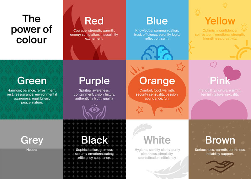
Research has shown that up to 90% of a consumer's initial assessment of a product is based on colour alone so choosing the right colour for your brand is paramount.¹ When it comes to choosing the colours to feature in your business’s logo, aesthetics are important. However, there are also subconscious ways that colours can make the consumer think, feel and behave. That's why it's so important to choose the right colours for your brand- you could be losing customers and you won't even know it.
Tshirt printing company ICON Printing has teamed up with Karen Haller, an international authority in the field of Applied Colour Psychology to reveal just how important colour is in branding.
Alex Econs merchandise expert and founder of ICON Printing said: “If you can establish which colours convey your brand's message best, it is possible to create a brand logo that truly engages your consumer whilst also on a practical level, standing out in the market.”

Taking 9 of the UK’s leading brands ranked by BrandIndex Index score and then switching the logos to the opposite colours on the colour wheel, Karen has revealed what effect this might have on the consumer to show just how powerful colour can be in branding.
Alex said: “Colours can have incredibly powerful effects on consumers and even the slightest change can make a big impact as Karen has explained. Every colour can generate influential emotions and associations, unique to an individual. By simply switching the original logo colours to the opposites on the colour wheel, we can see how colour might impact how consumers engage with the product itself but also think and feel about the brand as a whole.”

Cadbury- affordable luxury to an optimistic treat
- Original logo colour effects- luxury, authenticity, quality
- Opposite logo colour effects- optimism, friendliness, creativity
Karen said: “If Cadbury changed its branding to bright yellow it would instantly lose brand recognition. Its entire marketing message would no longer be about affordable luxury, instead, the message would focus on yellow’s positive psychological traits which are uplifting and happy.”

Royal Mail- eye-catching icon to indistinguishable
- Original logo colour effects- strength, stimulation, excitement
- Opposite logo colour effects- optimism, friendliness, creativity
Karen said: “If Royal Mail went back to green, even with a bright, vivid green, whilst better than the dark green of the 1800s, it would still be difficult to spot and lose its iconic presence and status.”

IKEA- everyday function to childish playfulness
- Original logo colour effects- efficiency, trust, friendliness
- Opposite logo colour effects- abundance, fun
Karen said: “Change the brand yellow to orange and the focus would shift more to one of fun and play. There would be a sense the brand was more child-focused, making it appealing to families with young children, but it might alienate their core age group.”

John Lewis- sophisticated elegance and exceptional quality
- Original logo colour effects- efficiency, simplicity, sophistication
- Opposite logo colour effects- sophistication, glamour, substance
Karen said: “From a colour psychology perspective, brands who use black convey they are sophisticated, elegant and classy. They are innovative and see themselves as an industry leader. Think Black American Express, Chanel and Cartier- aspirational with an air of exclusivity.

Netflix- serial excitement to natural zen
- Original logo colour effects- anticipation, stimulation, excitement
- Opposite logo colour effects- rest, peace, nature
Karen said: “If Netflix changed its brand colour to green, we would straight away lose that sense of anticipation, that excitement. Instead, we’re being encouraged to relax, unwind, like we feel when we are out in nature, amongst the trees.”

Boots- knowledgeable care to playful frivolity
- Original logo colour effects- knowledge, logic, trust
- Opposite logo colour effects- fun, frivolity
Karen said: “If Boots were to change their core brand colour to orange, we would see them as being fun and playful, not really what you want from your chemist when you need professional advice? Depending on the amount of orange they used, we might even feel the adverse effects of orange and see them as being frivolous which is not what we want from a chemist.”

Cathedral City- indulgent treat to diet option
- Original logo colour effects- indulgent, masculinity, regal
- Opposite logo colour effects- eye-catching, poisonous, low-fat
Karen said: “If Cathedral City were to change their brand colour to all blue, we would make the initial assumption that all its products were now in their ‘lighter’ range, potentially losing customers who were looking for a full-fat rich cheese.”

Visa- dependable service to unattainable opulence
- Original logo colour effects- knowledge, reliability, trust
- Opposite logo colour effects- prestige, desirability, exclusivity
Karen said: “If Visa switched to just using gold, that sense of accessibility, and the notion of their ‘every-person’ card is now gone. Gold branding gives the impression of prestige, desirability and of exclusivity. It’s creating the illusion this brand is now unattainable for their core target market.”

Samsung-trustworthy communications to premium exclusivity
- Original logo colour effects- reliability, communication, trust
- Opposite logo colour effects- aspirational, exclusivity, desirability
Karen said: “If Samsung changed their brand colour to gold, straight away it looks like a far more premium or a high-end product. Gold creates an air of exclusivity so Samsung becomes an aspirational brand and no longer a brand for everyone.”
Alex said: “Whilst the way we perceive colour will never be entirely objective due to cultural associations and individual experiences, advances in colour psychology reveal that there are subconscious ways that colours can affect the consumer. Understanding these and incorporating them into your branding is vital.”

