
The secret sauce to an all-powerful brand logo
Actually…no. The logo is the face of your company. It’s going to represent everything your business stands for, be relatable to your target audience, use an attractive and meaningful colour palette and have the potential to be iconic.
Unfortunately, not recognising the logo’s power is a mistake that many companies make. The truth is, a logo that is incongruent with your brand and doesn’t speak to your audience is null and void. It’s essentially useless.
Don’t fear, I’m going to reveal the secret sauce to an all-powerful brand logo that will give your company the ‘face’ it deserves.
But first…
What is a Logo?
On a daily basis we’re bombarded by logos. They’re on our phones, streets, adverts, coffee cups…pretty much everywhere we turn.
They say a picture can speak a thousand words and a logo is a symbol that represents a concise image of a company. On the whole, people find it easier to remember a simple image over words alone. Our eyes are naturally drawn to visual objects and strategically designed logos attract customers, solidify reputation and convey a brand’s essence easily.
While it can be tempting to put all the weight of communicating your brand’s identity on the logo’s shoulders, it’s actually a common misconception.
As Sagi Haviv, partner in New York based design firm Chermayeff & Geismar & Haviv, succinctly puts it: “Logo is not a communication, it is identification. It is the full stop at the end of a sentence, not the sentence itself”
You can learn more about logos from his Ted talk here:
I have many clients coming to me who want an ‘iconic logo’. I explain that a logo will be transformed into an ‘icon’ over time by onpoint and effective marketing communications. An iconic logo is created after decades of meaning poured into it over the long term.
Consider religious symbols…they are essentially just shapes. The meaning and connotations come after a long process, where symbolic value is created into the psyche of human beings.
So what does a logo need to be?
Here are my 3 golden logo rules:
-
Distinctive; it needs to rise above the ‘noise’ and be memorable
-
Appropriate; it needs to align perfectly with the brand’s personality and values
-
Simple; it needs to be easy to visually digest
Judging and creating logos is a complex process, and there are some common bugbears that always crop up.
‘This logo reminds me of…’ It’s human nature to look for associations, as the mind doesn’t like new things and immediately tries to line it up with something recognisable and familiar. Bear in mind that sometimes similarities are inevitable no matter how original the designer. Think of Chanel and Gucci, or Heineken and Macy’s – they live side by side in the same industries successfully, yet they bear resemblance to each other, it’s not the end of the world.
‘This logo should say a lot about us…’ It should emulate your brand, but it doesn’t have to perfectly encapsulate every value, personality trait and product under your umbrella. As renowned designer, Michael Bierut says, a logo is really just ‘an empty vessel that you pour meaning into’.
‘We need to love our logo…’ Contrary to popular belief, you don’t need to fall in love with your logo. It needs to be functional and align with your brand. Word to the wise: take out the subjectivity and look at the functionality. If it functions, it will grow on you over time.
“It needs to be a work of art…” It is not about about artistry and admiration. It needs to work in the long term. Michael Bierut says, “People think its a diving competition, but it’s actually a swimming competition, it’s not about how big of a splash you make it’s how long you can keep your head above the water”
‘We need a unique typeface…’ This isn’t necessarily true. Logo design isn’t about being pretty and aesthetically intricate, as we mentioned before. In fact, designing a superfluous typeface for the sake of it, can lead to ‘over-designing’ rather than a logo that’s in context with your brand.
Different Types
Like businesses, logos come in all shapes and sizes, but here’s a breakdown of the most common logotypes you’re likely to encounter:
1. Pictogram
These logos are made up of symbols or shapes and are easy to remember. Think Apple or Nike: they stick in your mind, are simple and stand out.
2. Wordmarks
These logos are usually the company name designed in attractive customised typography. Think of giants such as Coca Cola, Facebook and Visa…I bet you can picture them all in your head right now?
3. Lettermark
This is pretty much on the same vein as the wordmark, but is usually letters that form an abbreviation of a company name. Think NASA or HP – strong and effective.
4. Combination mark
Combination marks are a mix of symbols and words. Think KFC, Adidas and most car brands. These are tricky to conquer, as the two elements combined can often be dissonant or make the other fade into the background.
5. Emblem
These logos have a font within a symbol. Starbucks are a powerful example of this – imagine a badge type look and that’s an emblem logo.
The Secret Components
Powerful logos will stand the test of time. Having a professional, well-designed logo builds trust. It creates familiarity and strategically attracts your target audience.
The truth is, customers are more likely to do business with you if you have a well-designed logo.
So, what’s the secret?
1. Simple and memorable
A logo needs to be a clear, uncluttered and not an effort for your brain to digest. You want it to be interesting, but you don’t want someone to have to sit and stare to work out what it means. Take Amazon for example, it’s a classic combination mark logo that uses a simple customised typeface with an arrow swooping from the a?z . This works to denote the speediness of delivery (one of their key USPs), and represents a smile.
2. Distinctive
Remember, your logo is going to help you distinguish your brand from your competitors, so it’s important that yours stands out from the rest. While imitation is thought of to be the highest form of flattery, this isn’t the case with logos. Your design needs to be distinctive and unique.

3. Scalable and flexible
There’s no point having a logo that’s only suitable for the digital world, when it will need to be rolled out across multiple platforms, including print. It’s highly important to have a versatile logo that looks just as powerful on a screen as it does on a print, and just as impressive on portrait as it does on landscape.
5. The golden ratio
The Golden Ratio is a mathematical ratio that can be found in both man-made design and nature that describes the perfectly symmetrical relationship between two proportions. Approximately equal to a 1:1.61 ratio, the Golden Ratio can be illustrated using a Golden Rectangle: a large rectangle consisting of a square (with sides equal in length to the shortest length of the rectangle) and a smaller rectangle.
Put simply, if your designer can work with your logo to adhere to the Golden Ratio it can be aesthetically more pleasing to the human eye to look at.
Saying this, it’s important not to be a slave to mathematical principles, as sometimes what is aesthetically pleasing may be off mathematically. An example of this is the Google logo, as it’s widely recognised that its imperfections make it perfect.
Take a look at this article from Adweek, who delve into the secret of Google’s powerful logo.
6. Clarity of values and personality
In one glance your logo should be able to convey your brand’s values and personality. Is your brand dependable? Adventurous? Innovative? Approachable? Whatever your brand personality is, your logo needs to sing it loud and proud.
Any designer who knows their stuff will know exactly how to translate your brand’s personality through your logo. For example, a cool blue palette always denotes professionalism. Whereas it’s widely known that red and yellow are synonymous with hunger, which is particularly apt for a restaurant brand that prides itself on ‘fast food’ with no need for a drawn-out stay (hello, Maccy D’s).
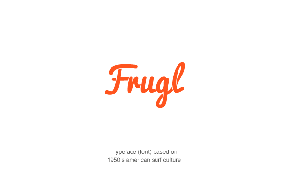
This is the same for translating your company character into an appropriate typeface or font. As an example, when we worked with frugl, their original typeface for the logo was chosen because vintage typefaces were fashionable. However the 50’s american surf culture font had nothing to do with their values and therefore was not relevant. We rebranded to align with key words from their strategy, like happy, childlike and friendly and now they are in talks with scottish rail.
7. Timless design
Your logo needs to stand the test of time. There’s no point in creating a logo that’s designed around a fad that could die out in 10 years time. Steer clear of anything too ‘edgy’ and stick to a classic, stylised font that you will still be in love with as the years go by.
8. Conceptual, not literal
Logo design is at its most powerful when it’s driven by a conceptual idea, rather than just a pretty-looking design. Literal design is also limiting, as if you decide to expand and diversify, you’re going to have trouble if your logo depicts only one side of your business.
We worked on conceptual logo design with The Creative Copywriter, a copywriting and marketing agency in London. They wanted a logo and identity to use across all their collateral and channels. Their unique selling point is harnessing craftsmanship of the written word from the 1950’s advertising era whilst using very modern marketing strategies – a duality of old and new.
We wanted to weave the 1950’s theme with a reference to newspapers; where most famous 1950’s ads were found during the golden era of copywriting. We honed in on the halftone circular patterns made during the printing process of newspapers. And then added a modern san serif typeface (font) with an juxtaposed electric green for the modern element.
Remember design is an indirect language which can say much more when it is subtle and used across the brand in a creative way.
9. Strategic
Lastly, remember that absolutely none of this matters if your logo doesn’t represent your company values. The logo, albeit highly important, is the end game. The starting point is a thorough branding strategy that will cement and hone your brand so it’s accurately positioned in the market.
The logo is essentially part of a wider brand identity, which is forged through your brand strategy. Brand strategies can’t be based on your own assumptions, they need to be carried out by a branding professional who understands the intricacies of the process.
This is why we start with brand strategy at Muneebah Creative. It is an integral part of our process when designing brand identities for our clients. Take the time to invest in a brand strategy before you kick off. It will be the smartest decision you make for your brand.